We Create Spaces that Inspire
Grand Prix of Architects
Winner of the National Architecture Award
Prize in the category
Sustainable Building
Rohan Office Building ARCHÉ
We Have Initiated Work on New Žižkov Center Project

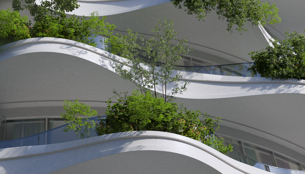
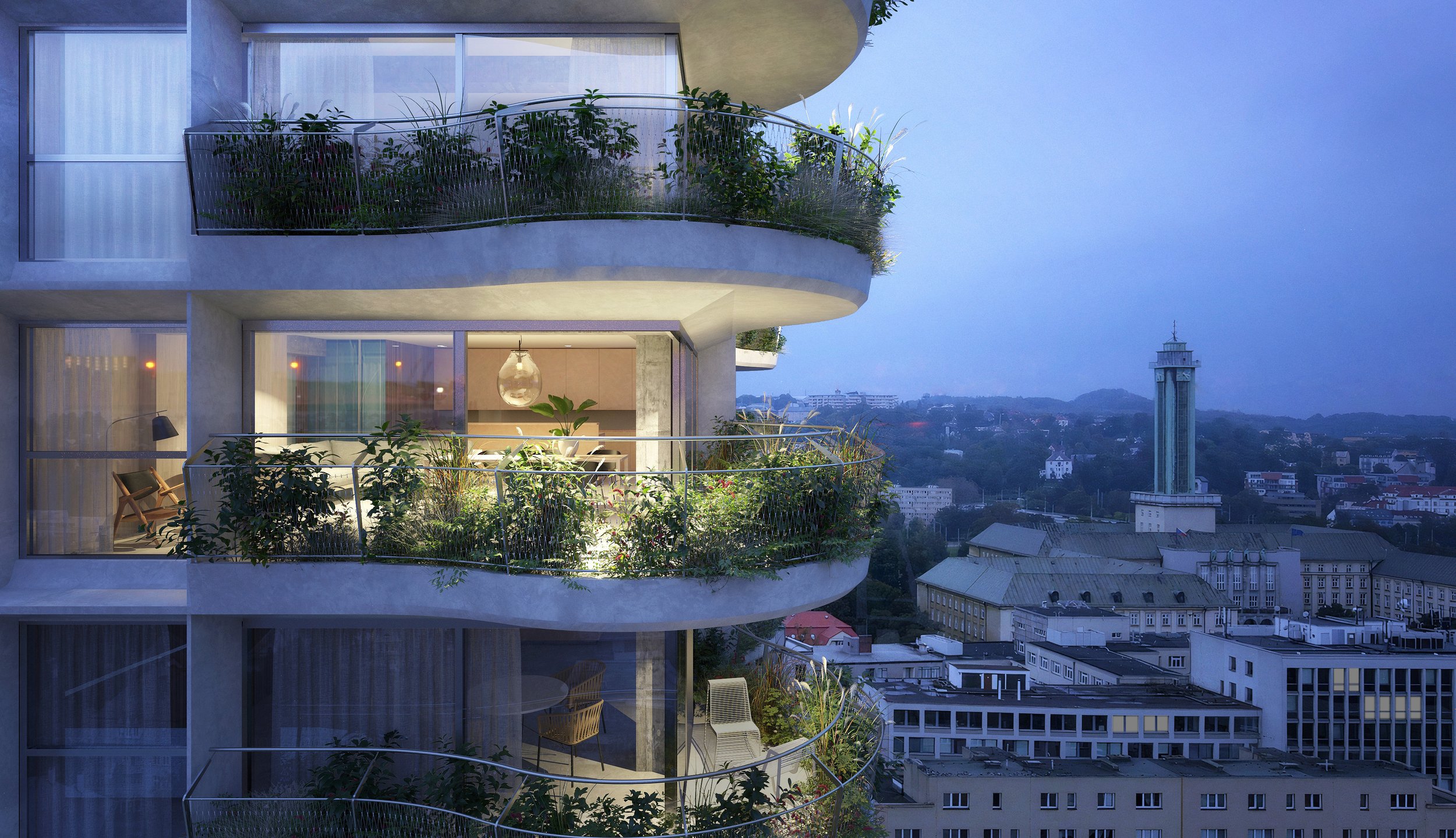
Living in the Green Is not Just a Dream…
-

Residential
We pay attention to the details and materials that create timeless residential buildings, highlighting the connection between interior and exterior.
-
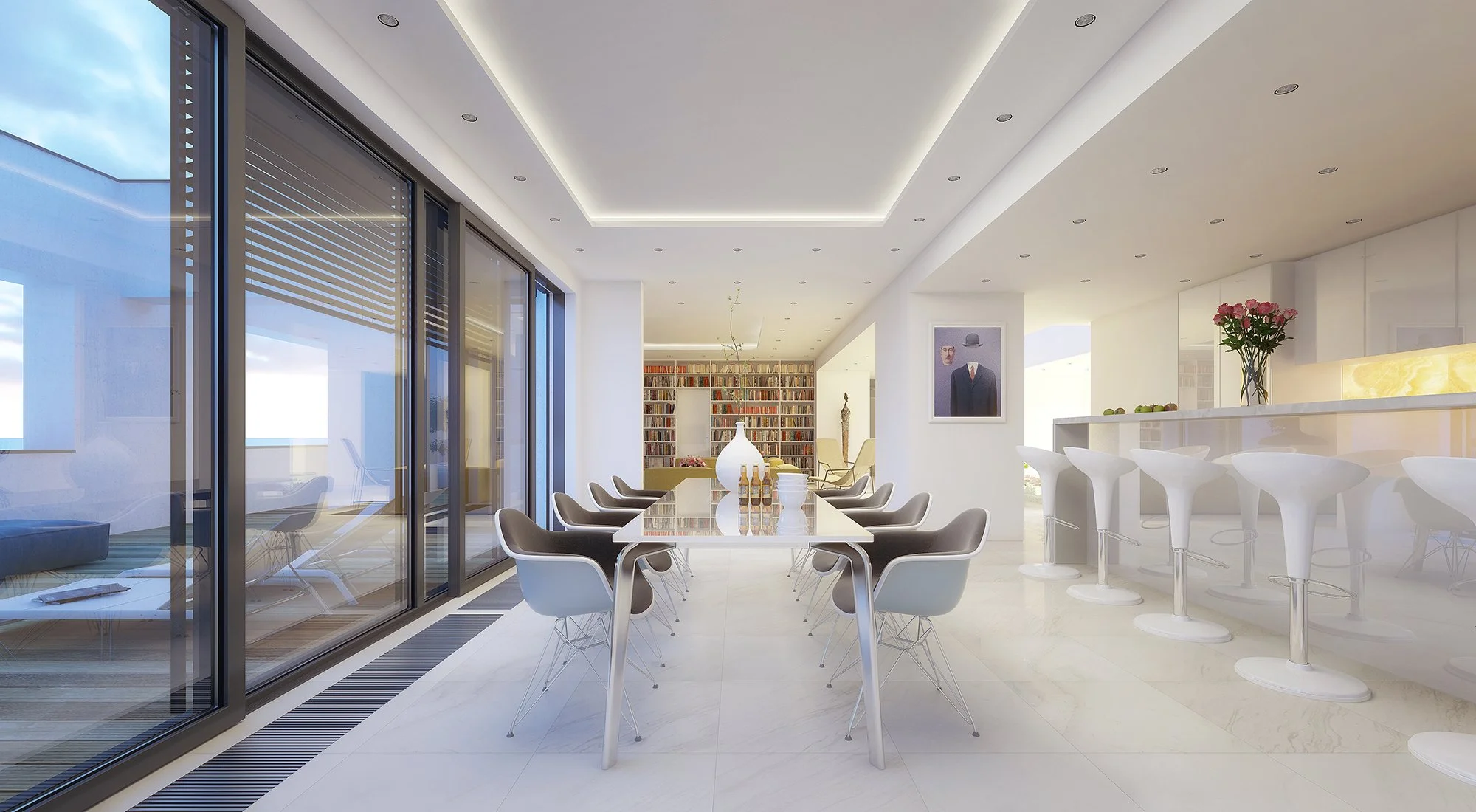
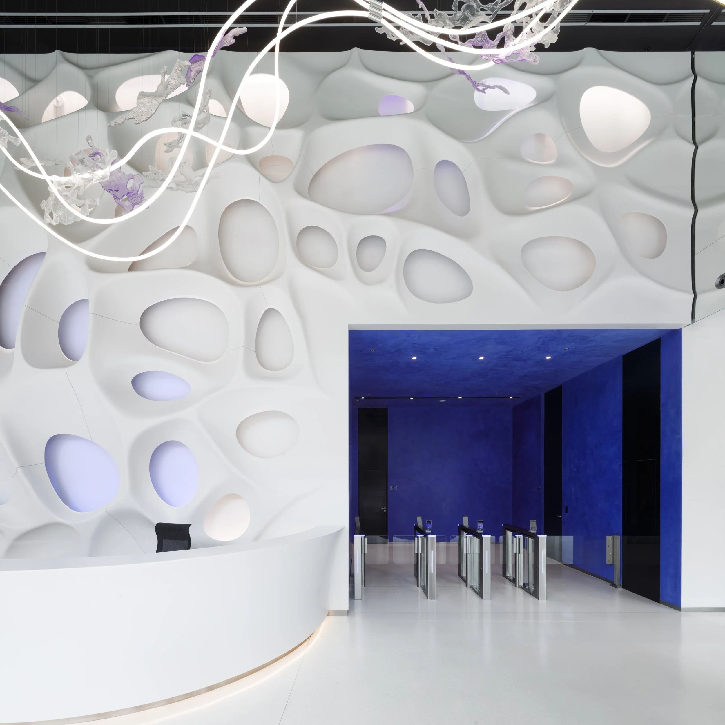
Interiors
We design interiors that are characterized by their spaciousness and light, complemented by soft tones and elegant color accents.
-

Staircases
From glass and steel to wood and concrete, we design staircases that are not only functional but also unique architectural pieces.
-

Public
Our public buildings are creatively designed to connect and serve the community, focusing on sustainability and functionality.
-

Private
Every private project reflects the unique needs of the client, focusing on details and quality craftsmanship that highlights their individuality.

Our Cultural and Congress Center in Zlín Brings People Together for more then 13 years…

Public Buildings Have Special Meaning for Us
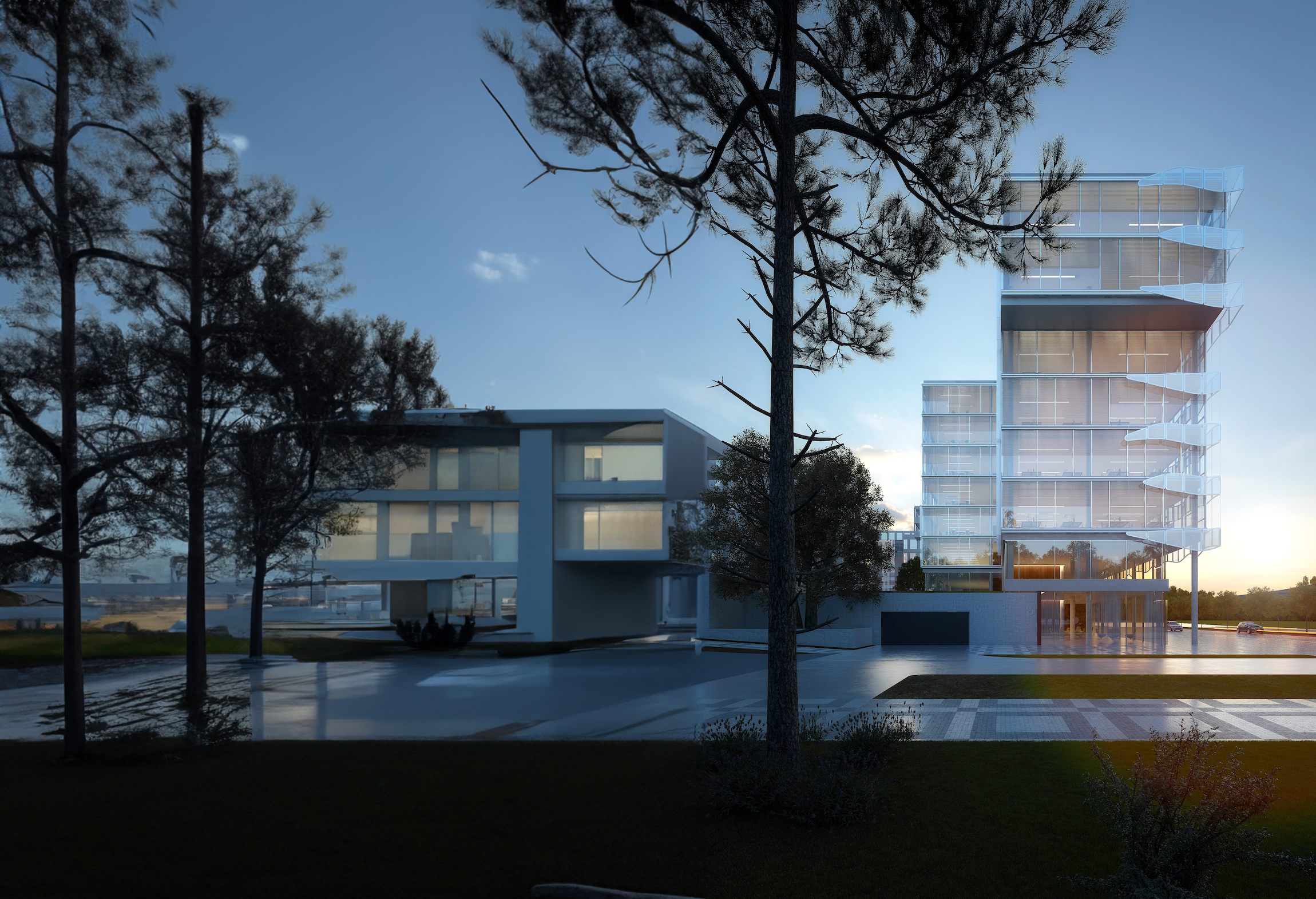
We are Designing Efficient Work Environments

Future-Ready Offices, Livable Today
Hotels Are Our Passion

Hotel Josef is Eastern Europe's First Design Hotel
Buildings like Hospitals We Design with Special Care

Healing Spaces, Healthy Lives
Sensitive Solutions for Exceptional Reconstructions

Elegant and Timeless Residential Homes
From Schools to Libraries to Concert Halls and Congress Centers We Create Public Buildings that Enrich Communities and Elevate Urban Living

We Create Educational Spaces that Motivate
Simplicity is Our Goal

Shops That Sell by the Power of Design
Together with Engineers and Craftsmen We Deliver Unique Pieces of Interior

Detail is Everything…

We Create Events Designing Your Memories
